


In the beginning, when I started as a UI Developer, I suffered more from designing pages properly, as I don’t have proper knowledge of all the most important CSS properties. Even some of them were unknown to me. I am writing this blog, so a beginner can start well and improve himself soon.
All these Properties of CSS are important for web designers. I am discussing the best CSS properties which will be used in all kinds of websites.
Best 16 CSS Properties For UI Developer-
1. Hover with Transition
The hover property allows us to change the CSS property of the hovered element, but it’s good to use hover property always with “transition”.
For Example 1.1, when we hover on an element, and then the color will be changed from white to black with a transition of 0.5s.
					Example 1.1
a {
  transition: background 0.5s ease;
  background: #fff;
}
a:hover {
  background: #000;
}
2. nth-child
We can select any specific element using this property corresponding to its parent and can apply CSS to that element.
For Example 2.1, we have applied color on the 3rd child of “ul.
					Example 2.1
<ul>
  <li>first-child</li>
  <li>second-child</li>
  <li>third-child</li> /*3rd child*/
  <li>fourth-child</li>
  <li>fifth-child</li>
</ul>

ul li{
  color: black;
}
ul li:nth-child(3){
  color: blue;
}
3. Overriding Style
We can force to change the style of any element. It can be achieved using “!important” or make it more specific.
					Example 3.1
p {
  color:#fff;
}
Overriding above element-
#parent-id p or .parent-class p {
  color:#000; (more specific)
}
p {
  color:#808080 !important; (more strong)
}
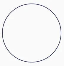
4. Border Use
The border has multiple uses. You can create Triangle, Circle using borders.
					Example 4.1
.triangle {
  width: 0;
  height: 0;
  border-style: solid;
  border-width: 0 15px 20px 15px;
  border-color: transparent transparent #363762 transparent;
}
					Example 4.2
.circle {
  width: 200px;
  height: 200px;
  background-color: #000;
  border-radius: 50%;
  border: 2px solid red;
}
					Example 4.3
.arrow {
  transform: rotate(45deg);
  position: relative;
  display: inline-block;
  padding: 10px;
  box-shadow: 3px -3px 0 0 tomato inset;
}
5. Position
The CSS position property also has an important role in the UI. Some designs can only achieve using position property.
Position Absolute is fully dependent on its any parent element whoever contains relative position, and the fixed property totally depends on the viewport. It means a fixed element never moves even if the page scrolled.
					Example 5.1
.relative {
  position: relative;
}
.absolute {
  position: absolute;
  top: 20px;
  right: 20px;
}
.fixed {
  position: fixed;
  top: 20px;
  right: 20px;
}
6. Transform
This Property of CSS contains multiple properties like rotate, scale, translate. You can make any element double size using scale property. Just set its value two, as given for example.
					Example 6.1
.rotate div {
  transform: rotate(20deg);
}
.skew div {
  transform: skew(20deg);
}
.scale div {
  transform: scale(2);
}
7. Z-index
Many people make mistakes using z-index because they don’t have actual knowledge of z-index. The first thing, z-index, is not working without positioning property. z-index defines the stack order of an element, which means which layer will be at the top, it can be decided by giving a z-index value of that element.
					Example 7.1
div.a {
  z-index: 1;
  position: relative;
}
div.b {
  z-index: 2;
  position: relative;
}
div.b will be at the top order.
8. * + > selector
The * selector allows you to apply CSS for all. We can make it specific, like using parents, we can apply CSS for all its child elements.
For Example 8.1, the color property will apply to every child (even the child of a child) of ul.
					Example 8.1
<ul>
  <li>first-child</li>
  <li>second-child</li>
  <li>third-child</li>
  <li>fourth-child</li>
  <li>fifth-child</li>
</ul>

ul * {
  color: #000;
}
The + selector allows you to apply CSS to the corresponding sibling of any element.
					Example 8.2
ul li + li {
  color: #000;
}
The > is used for the direct child selector. If any element child and that child again have a child, then we can use > selector to specify which element CSS will be applied.
					Example 8.3
ul > li {
  color: #000;
}
9. Object-fit
Using object-fit property, we can keep our image in the proper way. The image will not be getting stretched. But in a responsive nature, some image parts can be cut off, so use it wisely.
					Example 9.1
img {
  object-fit: cover/content;
  object-position: center/left/right;
}
10. :after, :before
There is no website where I have not used pseudo-elements. It always has a big role in designing. We can do different styling using pseudo-elements CSS Property.
					Example 10.1
.container{
  position: relative;
}
.container::before {
  content:"";
  display: block;
  height: 100%;
  position: absolute;
  top: 0;
  left: 0;
  width: 100%;
  z-index: 1;
  background-color: rgba(255, 255, 255, .8);
}
11. vw, vh
This unit has been used many times in my projects. Sometimes you will find out that % is not working properly for your project, in that situation, you can use vw, vh the unit, and for making font-size responsive, I always preferred to the use of a vw unit using calc. It works according to windows viewport width if you have a screen resolution 1600px wide then 1vw = 16px, if 1920px then 1vw = 19.2px.
					Example 11.1
div.abc {
  position: absolute;
  left: 20vw;
}
h2 {
  font-size: 36px;
  font-size: calc(20px + 1vw);
}
12. Flex
One of the most useful CSS Properties. I remember that critical situation whenever I saw a design with a center-aligned title, or say some icons which needed to maintain in the center with a rounded corner background border. It was very difficult to manage that before three years. But after coming into the full existence of flex property, it becomes very simple. Now you need to apply just three properties for that.
					Example 12.1
div.parent {
  display: flex;
  align-items: center;
  justify-content: center;
}
Again, you can easily maintain the order of your child element using order with the flex property.
					Example 12.2
div.parent {
  display: flex;
}
div.parent div.child-a {
  order: 2;
}
div.parent div.child-b {
  order: 1;
}
13. Pointer-events
This is a tricky property. Be careful before using it. Using this property means the element cannot be selected by anyone. Even if it is a link, then it becomes not clickable.
					Example 13.1
div.a {
  pointer-events: none;
}
14. Line-height
People make mistakes when giving value in line-height. Let’s take an example when you apply default font-size 20px in your p element with line-height 27px, and in responsive nature default font-size if changed like16px, then you again need to change in line-height. That’s why I always prefer to give line-height in such a manner.
					Example 14.1
p {
  line-height: 1.3;
}
15. Overflow
Using overflow property as hidden is not a good idea. If you are applying it to the body, then it is not fair. It means you are hiding your mistakes. But there are some situations where you have to apply such property. But sometimes it creates lots of problems when you have multiple child and you are not sure where you have applied overflow hidden property. So, I suggest you avoid the use of it, and if you use it, then always remember where you have applied it otherwise it can create problems for you in responsive nature.
					Example 15.1
div.parent {
  overflow: hidden;
}
16. Filter
Filter contains multiple properties. Using grayscale (1) we can make the image colorless. Using brightness (2) we can change color, but not exactly what we need. Using blur (1px) we can make text or image blurry. Using drop-shadow (2px 4px 6px black) we can make a shadow of any.png image.
					Example 16.1
.grayscale img{
  filter: grayscale(1);
}
.brightness img{
  filter: brightness(2);
}
.blur img{
  filter: blur(1px);
}
.drop-shadow img{
  filter: drop-shadow(2px 4px 6px black);
}
I hope that the CSS properties for UI Developer, described above will somehow help you.
If you have any questions about this feel free to ask/write to us or visit us at EncoreSky.


